My latest blog post covered using Ranked-Choice voting and reddit user rankings to determine the (second) best Black Mirror Episode. The key visualization was the Sankey diagram, and in this vignette I’ll walk through my R code for how the chart was made.
Libraries and Packages
library(tidyverse)
library(forcats)
library(magrittr)
library(knitr)

library(alluvial)
library(ggalluvial)
library(extrafont)
colortable <- read_csv("c:/Users/blaze/Documents/R_Projects/BlackMirror/color_palette.csv")
Lots of packages here:
- Tidyverse - all encompassing package for data manipulation and visualization
- forcats - enables better ordering of factor variables (episode names) when plotting
- magrittr - I did some in-line code, and magritter has some functions like multiply_by() that allow you to perform arithmetic in a %>% pipeline
- knitr - For kable tables
- extrafont - Loading of other fonts
- alluvial - necessary for Sankey plots
- ggaluvial - enables Sankey plots
Also I have my color palette for each episode. You don’t want to know how these colors were chosen1.
Loading Data
You’ll need to download the raw user rankings off my github. The only data manipulation is pivoting the data from “wide” to “long” format2.
The gather() function pivots the data, we name “episodes” as the key (what the column names will be called) and rankings as the values (what the data in those columns will now be called), while telling the function to not mess with the columns user, other, or id.
rawranks <- read_csv("c:/Users/blaze/Documents/R_Projects/BlackMirror/CompiledRedditRanks.csv")

head(rawranks)
## # A tibble: 6 x 22
##   user       other      id `White Christma~ `San Junipero` `USS Callister`
##   <chr>      <chr>   <int>            <int>          <int>           <int>
## 1 TheOnlyOn~ <NA>        1                1              4               8
## 2 [deleted]  <NA>        2                5              3               8
## 3 Seacattle~ <NA>        3                3              7               1
## 4 loonwin    IMDB        4                1              4               7
## 5 loonwin    Hollyw~     5               10              3               5
## 6 loonwin    PC Mag      6                2              4               6
## # ... with 16 more variables: `Hang the DJ` <int>, `Shut Up and
## #   Dance` <int>, `White Bear` <int>, `The Entire History of You` <int>,
## #   Nosedive <int>, `Black Museum` <int>, `Be Right Back` <int>, `Fifteen
## #   Million Merits` <int>, `Hated in the Nation` <int>, Playtest <int>,
## #   `The National Anthem` <int>, Arkangel <int>, Crocodile <int>, `Men
## #   Against Fire` <int>, Metalhead <int>, `The Waldo Moment` <int>

longranks <- rawranks %>%
  mutate(id = factor(id)) %>%
  gather(key = episode, value = ranking, -user, -other, -id)

head(longranks)
## # A tibble: 6 x 5
##   user              other     id    episode         ranking
##   <chr>             <chr>     <fct> <chr>             <int>
## 1 TheOnlyOne87      <NA>      1     White Christmas       1
## 2 [deleted]         <NA>      2     White Christmas       5
## 3 SeacattleMoohawks <NA>      3     White Christmas       3
## 4 loonwin           IMDB      4     White Christmas       1
## 5 loonwin           Hollywood 5     White Christmas      10
## 6 loonwin           PC Mag    6     White Christmas       2
Barplot of 1st place votes
Now that we have long data, we’ll calculate what percentage of 1st place votes each episode recieved, and then plot that in a barplot.
#Count how many users ranked an episode #1
n_users <- longranks %>% filter(ranking == 1) %>% nrow()

#Count votes by episode
votecount <- longranks %>%
  # Limiting to only #1 choices
  filter(ranking == 1) %>%
  # group_by() decides how summarise() will work
  group_by(episode) %>%
  # Votes will be the raw number of votes, while pct will be divided by number of users
  summarise(votes = n(), pct = n() / n_users) %>%
  arrange(desc(pct)) #Sort final dataframe

votecolor <- votecount %>%
  #Join in palette table
  left_join(colortable, by = "episode")

head(votecolor)
## # A tibble: 6 x 4
##   episode                   votes    pct color
##   <chr>                     <int>  <dbl> <chr>
## 1 White Christmas              25 0.225  #333D7A
## 2 Shut Up and Dance            17 0.153  #C3AC46
## 3 The Entire History of You    13 0.117  #B2A595
## 4 San Junipero                 12 0.108  #8E548A
## 5 Fifteen Million Merits        9 0.0811 #C11652
## 6 Be Right Back                 8 0.0721 #5ED5EA

# Barplot
ggplot(votecolor, aes(
  x = fct_inorder(episode), # Episodes along the x-axis, but as factors
  #and in order of appearance (which is first to last due to the arrange above)
  y = pct,
  color = color, fill = color)) +
  scale_color_identity() + #Make the colors exactly as they appear in the color column
  scale_fill_identity() +
  geom_bar(stat = "identity") +
  theme(panel.background = element_blank(),
        axis.ticks = element_blank(),
        axis.text.x = element_text(angle = 45, hjust = 1),
        text = element_text(family = "Century Gothic", face = "bold"),
        plot.title = element_text(hjust = 0.5, size = 20),
        plot.subtitle = element_text(hjust = 0.5, size = 16)) +
  xlab("") +
  ylab("Percent of 1st place votes") +
  labs(title = "First Place Votes")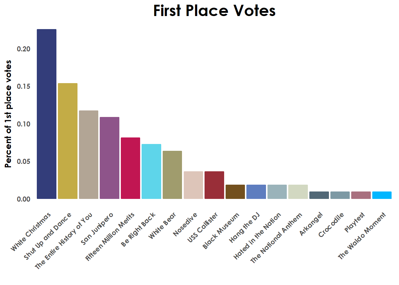
Plot of all votes by episode
To make the plot showing every vote for each episode (and summary details) we’ll group the data by episodes and calculate the mean ranking for each episode and order the data.
by_avg_ranks <-longranks %>%
  group_by(episode) %>%
  summarise(avg_rank = mean(ranking, na.rm = TRUE)) %>%
  arrange(avg_rank) %>%
  mutate(episode = fct_inorder(episode)) #Set factor order after arrange()

#add in color
longcolor <- longranks %>%
  left_join(colortable, by = "episode")


ggplot(longcolor, aes(y = ranking,
                      # Set order of episodes on x-axis by level order in by_avg_ranks
                      x = factor(episode,
                                 levels = levels(by_avg_ranks$episode)),
                      color = color)) +
  scale_color_identity() +
  geom_boxplot(fill = NA, outlier.shape = NA) +
    #Outlier.shape = NA is important, without this we would have
    #duplication of outlier points since we're plotting every point anyways
  geom_jitter(height = 0.2, width = 0.2, size = 3, alpha = 0.3) +
    #Jitter allows us to see more of the points with a limited y-axis distortion
  scale_y_reverse(breaks = c(1,5,10,15,19)) +
  xlab("") +
  ylab("Ranking") +
  theme(axis.ticks = element_blank(),
        axis.text.x = element_text(angle = 45, hjust = 1),
        text = element_text(family = "Century Gothic", face = "bold"),
        axis.text = element_text(angle = 45, hjust = 1),
        panel.background = element_blank(),
        plot.title = element_text(hjust = 0.5, size = 20),
        plot.subtitle = element_text(hjust = 0.5, size = 16)) +
  #Last, add in a black diamond for the mean rank of every episode
  #which makes the ordering choice clearer
  geom_point(data = by_avg_ranks, aes(y = avg_rank),
             pch = 18, size = 5, color = "black") +
  labs(title = "All votes",
       subtitle = "(Mean ranking in black)")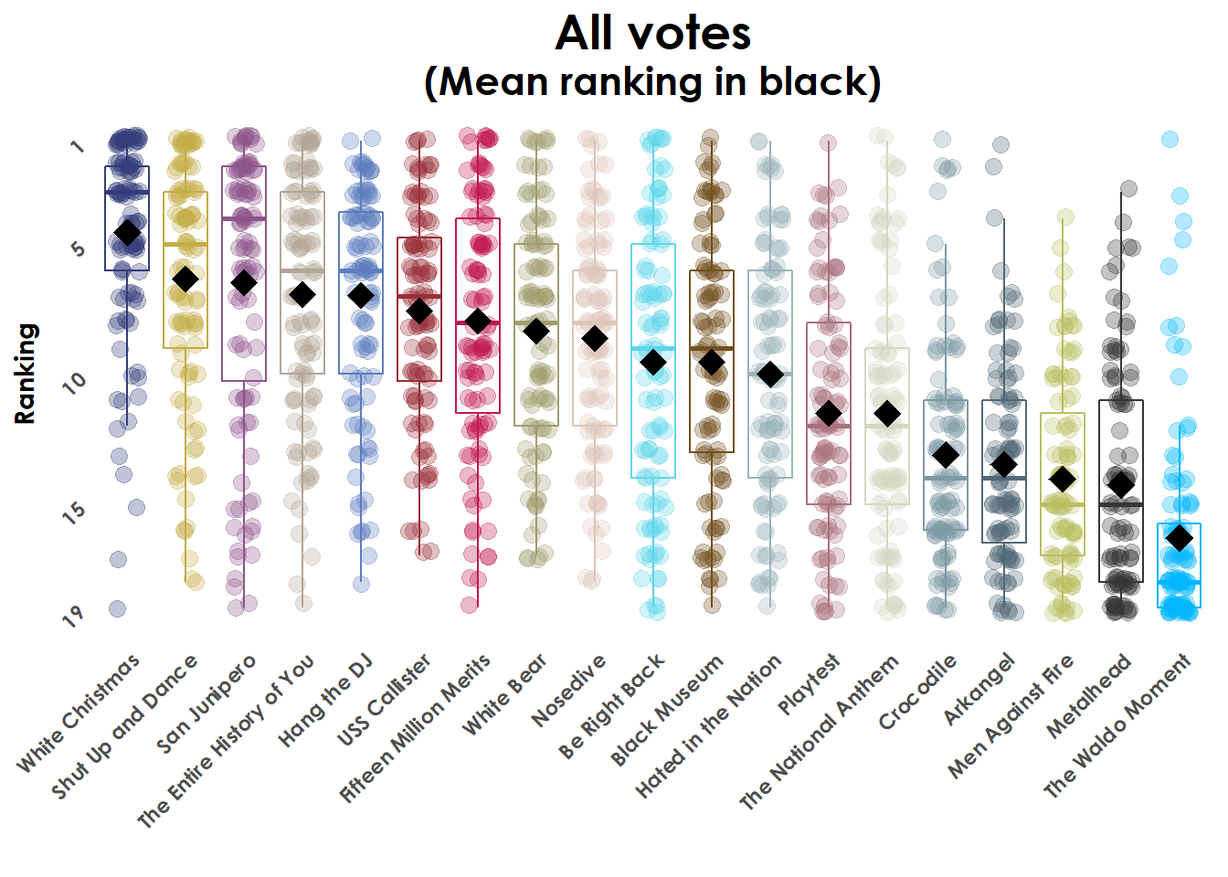
First Sankey diagram
So to make a Sankey diagram using ggalluvial we’ll need long data with columns for rounds of elimination (x-axis), the episodes (stratum), the id of the voter (alluvium), and the color choice.
To start we’ll make dataframes for each round, and then merge them together with bind_rows().
# This will sort the data on rakings
# but only keep rows the first time an id appears
# So only the top-ranked vote for each voter will be kept
# Lastly we'll name the round as 0
round0 <- longcolor %>%
  arrange(ranking) %>%
  .[!duplicated(.$id),] %>%
  mutate(round = 0)

#Repeat the above for round 1, but remove White Christmas from consideration
round1 <- longcolor %>%
  filter(episode != "White Christmas") %>%
  arrange(ranking) %>%
  .[!duplicated(.$id),] %>%
  mutate(round = 1)

# Bind data together
hammElimination <- bind_rows(round0, round1)

hammElimination[109:114,]
## # A tibble: 6 x 7
##   user          other id    episode          ranking color   round
##   <chr>         <chr> <fct> <chr>              <int> <chr>   <dbl>
## 1 bjt005        <NA>  42    Arkangel               1 #516876     0
## 2 LibGyps       <NA>  17    Crocodile              1 #7D99A4     0
## 3 bigbluemonkey <NA>  18    The Waldo Moment       1 #02B6FF     0
## 4 loonwin       The W 15    San Junipero           1 #8E548A     1
## 5 malacology    <NA>  27    San Junipero           1 #8E548A     1
## 6 Kr4d105s2_3   <NA>  32    San Junipero           1 #8E548A     1
The actual Sankey diagram is just a normal ggplot call, with a few new aesthetic fields: stratum (groups along the y-axis) and alluvim (individual records, or in our case voter id numbers).
ggplot(hammElimination,
       aes(
         x = round,
         stratum = episode,
         alluvium = id,
         fill = color,
         label = episode)) +
  theme(panel.background = element_blank(),
        axis.ticks = element_blank(),
        axis.text.y = element_blank(),
        axis.text.x = element_text(size = 12),
        axis.title = element_blank(),
        text = element_text(family = "Century Gothic", face = "bold"),
        plot.title = element_text(hjust = 0.5, size = 16),
        plot.subtitle = element_text(hjust = 0.5, size = 12)) +

  #geom_flow plots the curved lines between rounds
  geom_flow(stat = "alluvium", lode.guidance = "leftright") +

  #geom_stratum plots the larger "static" sections for each round
  #size=0 removes the box around each stratum
  geom_stratum(size = 0, color = NA, na.rm = TRUE) +
  scale_fill_identity() +
  ggtitle("Redistribution of White Christmas votes") +
  labs(subtitle = "Votes assigned to second choice") +
  #Label the stratum with episode names
  geom_text(stat = "stratum", family = "Century Gothic", fontface = "bold", color = "gray15", size = 2) +
  scale_x_continuous(breaks = c(0,1), labels = c("With Hamm","Without Hamm"))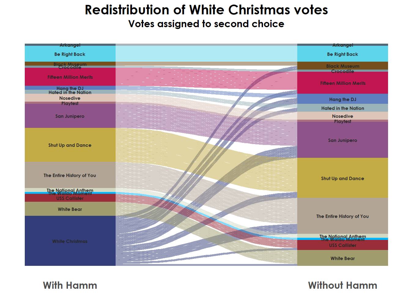
Running ranked-choice elimination
Alright, now a scalable way to run the full ranked-choice elimination so we can make the final chart.
We’ll set up a few variables before entering a large while-for loop. We’ll need a dataframe with the voter ids and a list of the episodes (“candidates” or voting options). I’m also starting empty vectors to store the user id, episode choice, and round number later on.
voter_ids <- longcolor %>%
  select(all_ids = id) %>% unique()

episode_list <- longcolor %>%
  filter(episode != "White Christmas") %>%
  select(episode) %>% unique() %>% .$episode %>% as.character()

user <- vector()
r_ep <- vector()
r_round <- vector()
roundcounter <- 0
The for() loop will filter down the vote list to only episodes still eligible to recieve votes (in the episode_list), remove any NA rankings, filter down to the single id under consideration in the loop, and then sort for the top ranking. The top episode is extracted and stored in the growing r_ep vector. I made the choice to record exhausted ballots (no eligible choice remaining) with “-”.
After the for() loop, we combine the vectors into a dataframe. Then to find the episode with the least votes (that needs to be eliminated next) we filter down to the current round, count the number of votes for each episode, and keep only episodes with more votes than the current minimum. Those episodes are stored in episode_list and used for another iteration of the for() loop.
This is all wrapped in a while() loop, that will terminate when there is only one episode left in the episode_list.
while(length(episode_list) > 1){
  roundcounter <- roundcounter + 1

  for(i in voter_ids$all_ids) {
    choice <- longcolor %>%
      filter(episode %in% episode_list) %>%
      filter(!is.na(ranking)) %>%
      filter(id == i) %>%
      arrange(ranking) %>% .$episode %>% .[1]

    #if(is.na(choice)) {next}
    if(is.na(choice)) {choice <- "-"}

    user <- append(user, i)
    r_ep <- append(r_ep, choice)
    r_round <- append(r_round, roundcounter)
  }

  nonWC_elimination <- data.frame(id = user, round = r_round, episode = r_ep)

  episode_list <- nonWC_elimination %>%
    filter(r_round == roundcounter &
             !is.na(episode) &
             episode != "-") %>%
    group_by(episode) %>% count() %>%
    ungroup() %>% filter(n > min(n)) %>% .$episode %>% as.character()

  #print(episode_list)

}
Final Sankey diagram
Now we have some housekeeping, converting variables to factors and joining with our color palette and then plotting as above.
nonWC_elimination$episode <- as.factor(nonWC_elimination$episode)
nonWC_elimination$id <- as.factor(nonWC_elimination$id)

nonWC_elimination_color <- nonWC_elimination %>% left_join(colortable, by = "episode")

ggplot(data =
         nonWC_elimination_color,
       aes(x = round, stratum = episode, alluvium = id,
                       fill = color, label = episode)) +
  theme(panel.background = element_blank(),
        axis.ticks = element_blank(),
        axis.text.y = element_blank(),
        axis.text.x = element_text(size = 12),
        axis.title = element_blank(),
        text = element_text(family = "Century Gothic", face = "bold"),
        plot.title = element_text(hjust = 0.5, size = 16),
        plot.subtitle = element_text(hjust = 0.5, size = 12)) +
  geom_flow(stat = "alluvium", lode.guidance = "leftright") +
  geom_stratum(size = 0, color = NA, na.rm = TRUE) +
  scale_fill_identity() +
  ggtitle("Ranked Choice Voting for Black Mirror Episodes") +
  labs(subtitle = "Non-Jon Hamm edition") +
  geom_text(stat = "stratum", family = "Century Gothic", fontface = "bold", color = "gray15", size = 3) +
  scale_x_continuous(breaks = seq(1,10,1), labels = c("Round 1", "Round 2", "Round 3",
                                                     "Round 4", "Round 5", "Round 6",
                                                     "Round 7", "Round 8", "Round 9",
                                                     "Round 10"))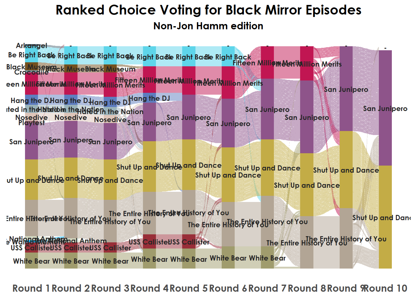
For the diagrams only showing a few rounds I took “data = nonWC_elimination_color” and added “%>% filter(round <= 4)” to restrict the dataset.
If you’re interested in other resources for ggalluvial I’d recommend Jason Cory Brunson’s vignette for the package (which I heavily relied on). Check out my final post, or the github repo for all of the underlying code and data. Thanks for reading!
Well if you must know, I’m slightly color blind and while it doesn’t impact my life much it’s resulted in me never quite trusting my eye to pick colors. So instead I often take them from elsewhere with Adobe Color or the eyedropper tool.
For this project I used google image search to pull an iconic image from each episode. I then loaded that image into Adobe Color and selected a single color that I thought fit the image and was unique from the other options. So White Christmas is Jon Hamm’s suit, San Junipero is Kelly’s jacket, Shut Up and Dance is Kenney’s yellow-tinted glasses. It’s probably too tedious and not effective enough, but, it’s what I did.↩“wide” data is easier for manual entry and probably how you think about data if you usually use a spreadsheet.
“long” is not very visually appealing, but far easier to work with in R and plot with ggplot↩